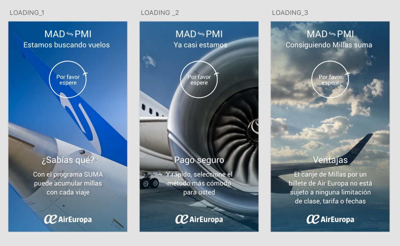
Giving useful messages to users while they are waiting for the next step (old mobile website)
Giving useful messages to users while they are waiting for the next step (old mobile website)
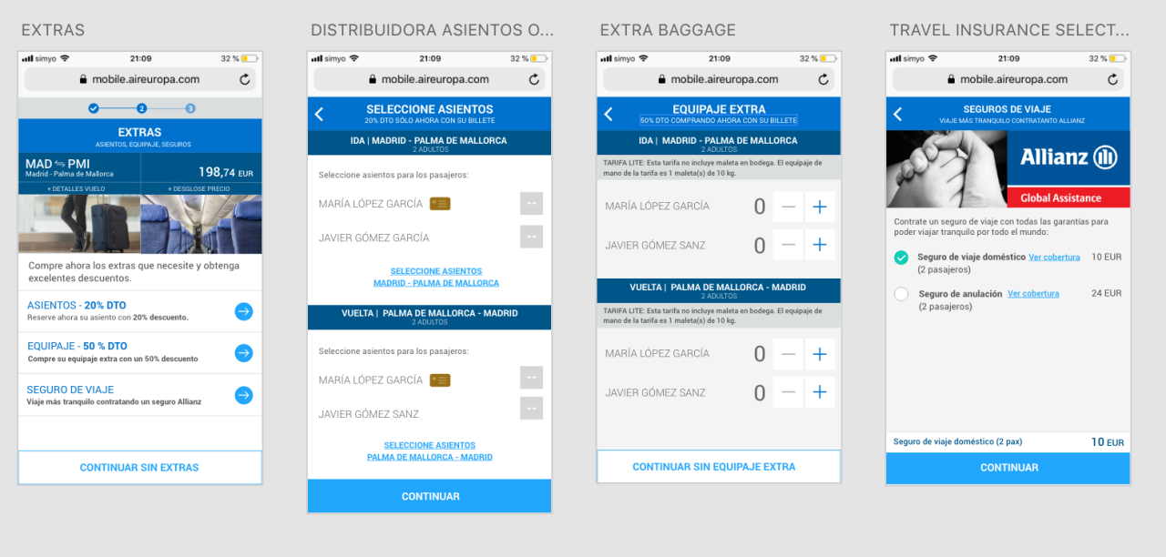
Searching and finding the best way to show the users the ancillaries flow adding pics and details to help legibility and usability.
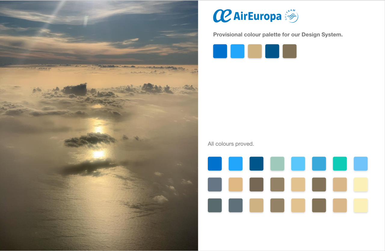
Creating a new colour palette for Air Europa based on sky and earth colours, to show the quality and excellence of our company having in count that we are the most sostenible airline and also to express our concern about the earth’s health.
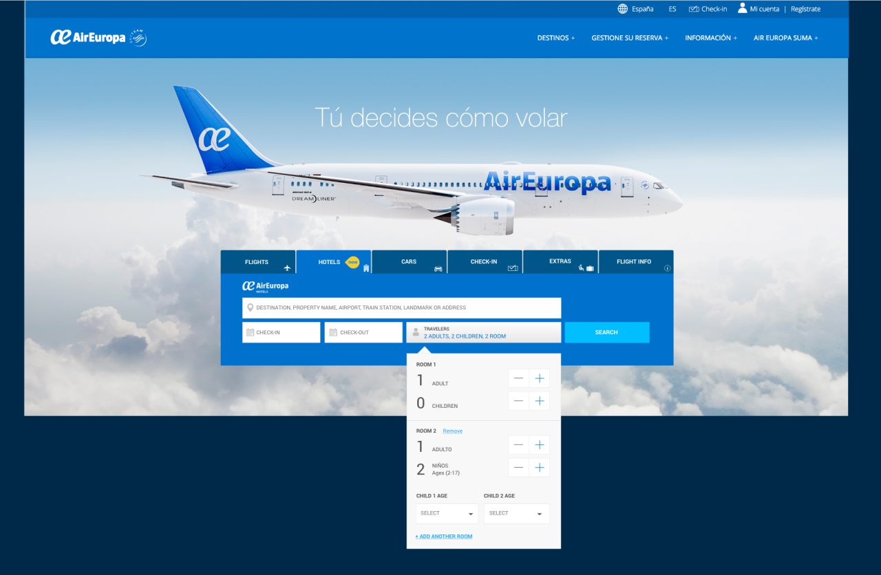

Finding the best way with several improvements at home search plus adding new tab for hotels. Old website (desktop view)
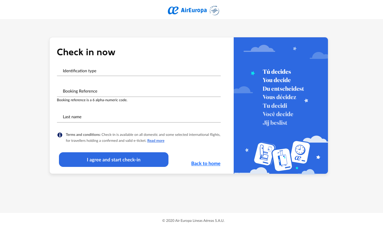
Access to check in (desktop view) where the users fill their data to enter the check in flo. Co-creating with Amadeus, their new flows called RefX, for check out (booking) and check in. The task -here- was redesign it with our Design System guides, also improve the flow’s usability.

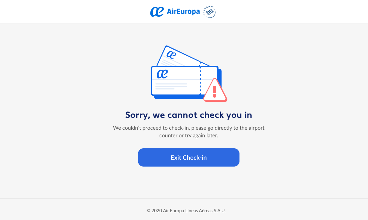
Design for some errors that can stop the flow (desktop view). Co-creating with Amadeus, their new flows called RefX, for check out (booking) and check in. The task -here- was redesign it with our Design System guides, also improve the flow’s usability.
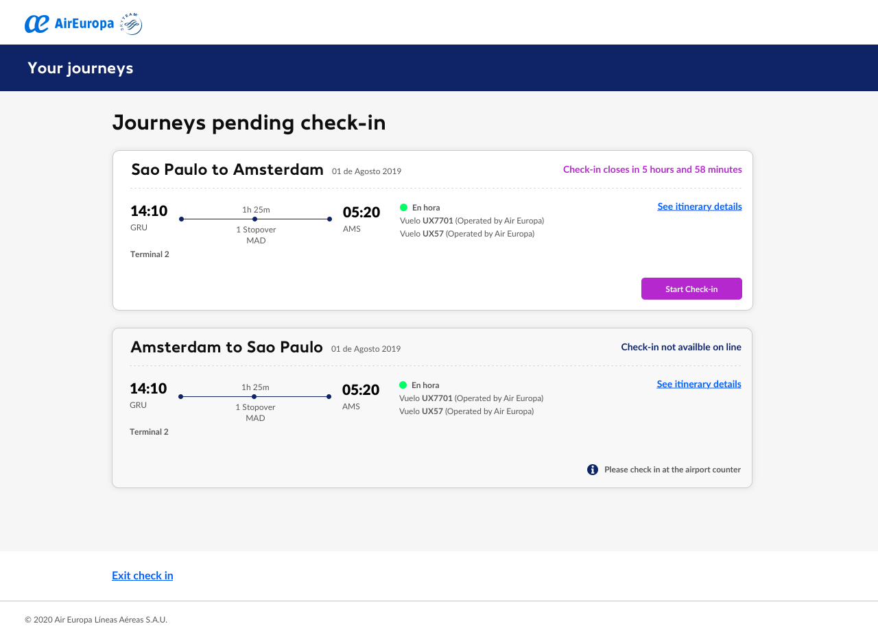
Your journeys step (desktop view) where the users can review their booking and check in to get their boarding passes. Co-creating with Amadeus, their new flows called RefX, for check out (booking) and check in. The task -here- was redesign it with our Design System guides, also improve the flow’s usability.

Select seats step (desktop view) where the users can choose their seats. Co-creating with Amadeus, their new flows called RefX, for check out (booking) and check in. The task -here- was redesign it with our Design System guides, also improve the flow’s usability.
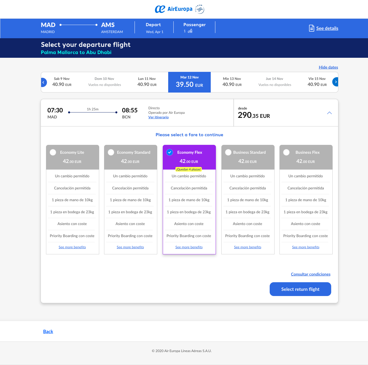
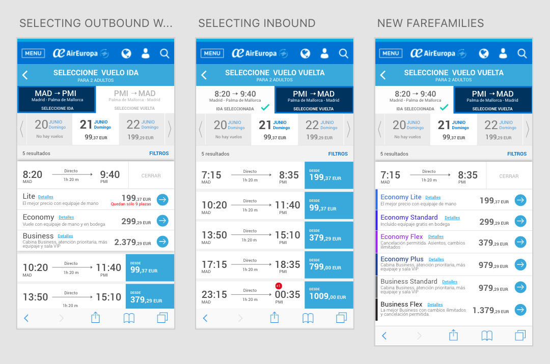
Fare Families displayed with one selected (desktop view) where the users choose their fare. Co-creating with Amadeus, their new flows called RefX, for check out (booking) and check in. The task -here- was redesign it with our Design System guides, also improve the flow’s usability.
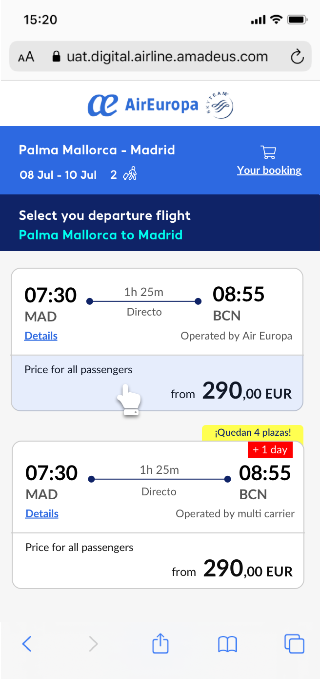
Availability step (mobile view) where the users can choose the flight they want to. Co-creating with Amadeus, their new flows called RefX, for check out (booking) and check in. The task -here- was redesign it with our Design System guides, also improve the flow’s usability.
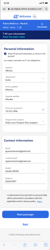
Passenger’s form step (mobile view) where the users fill their data. Co-creating with Amadeus, their new flows called RefX, for check out (booking) and check in. The task -here- was redesign it with our Design System guides, also improve the flow’s usability.
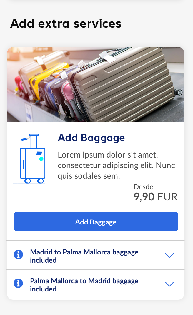
Add baggage module step (mobile view) where the users can add bags to their booking. Co-creating with Amadeus, their new flows called RefX, for check out (booking) and check in. The task -here- was redesign it with our Design System guides, also improve the flow’s usability.
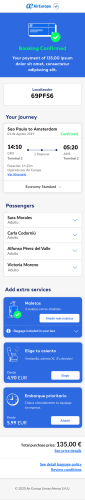
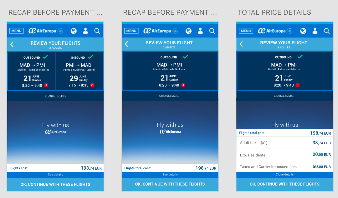
Co-creating with Amadeus, their new flows called RefX, for check out (booking) and check in. This pic shows the shopping cart step where the users can add services to their booking. The task -here- was redesign it with our Design System guides, also improve the flow’s usability.